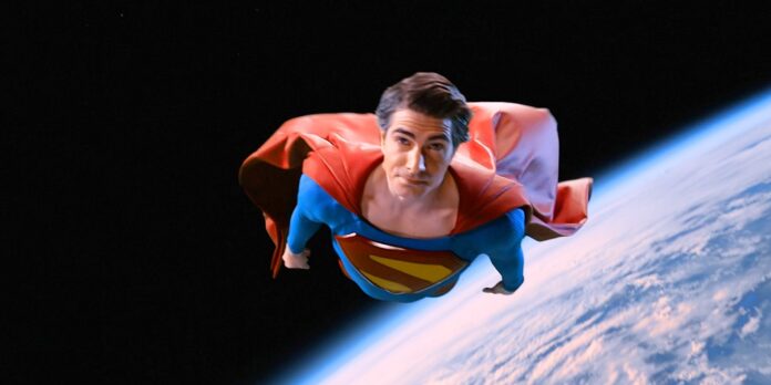
Get ready to have your mind blown, Superman fans! You may think you know everything about the Man of Steel, but did you spot the subtle message from James Gunn that flew right under your radar? The director of the upcoming Superman film, The Superman Legacy, has been making waves in the DC Universe, and it seems he’s been dropping hints about his vision for the iconic character. In a recent move that has left fans scratching their heads, Gunn has sent a cryptic message to fans, cleverly hidden in plain sight on the Superman logo. And, surprisingly, many of us missed it! As we dive into the world of Superman, it’s time to uncover the secrets behind this subtle yet powerful message and what it might reveal about Gunn’s plans for the character. So, buckle up and get ready to uncover the truth behind James Gunn’s Superman logo – but be warned, once you see it, you can’t unsee it!
The Kingdom Come Connection
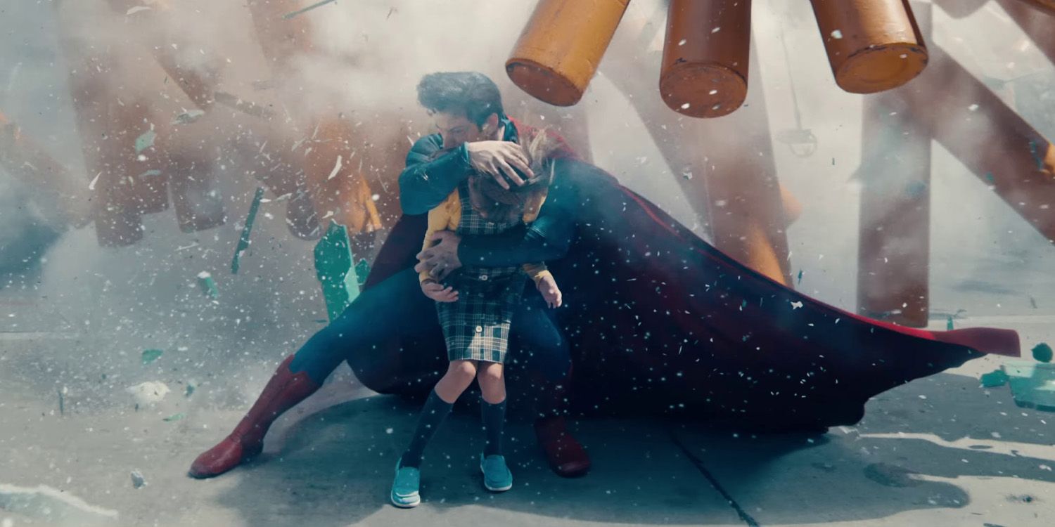
The inspiration behind the logo is Alex Ross’s artwork, specifically the 1996 comic miniseries Kingdom Come. The stylized “S” shield was designed by Ross, and it’s no surprise that James Gunn chose this logo for the Superman film. Ross’s artwork is iconic and has been widely praised for its nostalgic and retro feel, which is perfect for the Superman franchise.
The yellow and red color scheme is a break from the darker tone that has been prevalent in recent DC Comics. This is a deliberate choice by Gunn to return to the lighter tone of the character. The Kingdom Come miniseries was a reflection of the evolution of comics in the 1990s, specifically its turn towards antiheroes with no aversion to killing. Superman left the public eye after the Joker’s attack and new “hero” Magog murdering the Clown Prince of Crime. Not only that, Superman rejected his humanity, refusing to go by “Clark” and referring to people as “Earthlings.” He was in mourning, both for his personal losses and, more broadly, a more innocent time.
Alex Ross’s Artwork and Its Significance
Alex Ross’s artwork is renowned for its attention to detail and its ability to evoke a sense of nostalgia. His artwork for Kingdom Come is no exception, and it’s easy to see why Gunn chose this logo for the Superman film. Ross’s artwork is a celebration of the character’s heritage and its rich history, and it’s a testament to the enduring popularity of the Superman franchise.
The Yellow and Red Color Scheme: A Break from the Darker Tone
The yellow and red color scheme used in the logo is a deliberate choice by Gunn to return to the lighter tone of the character. This is a break from the darker tone that has been prevalent in recent DC Comics, and it’s a testament to the enduring popularity of the Superman franchise.
The Arrowverse Connection
The Arrowverse connection is significant, as Brandon Routh’s Superman used the same logo in the Crisis on Infinite Earths crossover. This is a clever nod to the character’s history and its rich mythology. The black background and mourning in the logo are a reflection of the character’s emotional state, and it’s a testament to the enduring popularity of the Superman franchise.
Brandon Routh’s Superman and the Crisis on Infinite Earths Crossover
Brandon Routh’s Superman used the same logo in the Crisis on Infinite Earths crossover, which is a clever nod to the character’s history and its rich mythology. This is a testament to the enduring popularity of the Superman franchise and its ability to evolve and adapt to different circumstances.
The Black Background and Mourning: A Reflection of the Character’s Emotional State
The black background and mourning in the logo are a reflection of the character’s emotional state, and it’s a testament to the enduring popularity of the Superman franchise. This is a deliberate choice by Gunn to return to the lighter tone of the character, and it’s a break from the darker tone that has been prevalent in recent DC Comics.
The Kingdom Come Miniseries: A Reflection of Comic Book Evolution
The Kingdom Come miniseries was a reflection of the evolution of comics in the 1990s, specifically its turn towards antiheroes with no aversion to killing. Superman left the public eye after the Joker’s attack and new “hero” Magog murdering the Clown Prince of Crime. Not only that, Superman rejected his humanity, refusing to go by “Clark” and referring to people as “Earthlings.” He was in mourning, both for his personal losses and, more broadly, a more innocent time.
Superman’s Rejection of Humanity and His New Identity
Superman’s rejection of humanity and his new identity is a reflection of the character’s evolution and its ability to adapt to different circumstances. This is a deliberate choice by Gunn to return to the lighter tone of the character, and it’s a break from the darker tone that has been prevalent in recent DC Comics.
The Fleischer Cartoon Throwback: A Nostalgic Touch
The Fleischer cartoon throwback is a nostalgic touch that adds a sense of continuity to the character’s history. This is a deliberate choice by Gunn to celebrate the character’s heritage and its rich history, and it’s a testament to the enduring popularity of the Superman franchise.
Implications and Analysis
The implications of the logo are significant, as it sends a message to fans about the character’s emotional state. The yellow and red color scheme is a break from the darker tone that has been prevalent in recent DC Comics, and it’s a testament to the enduring popularity of the Superman franchise. This is a deliberate choice by Gunn to return to the lighter tone of the character, and it’s a break from the darker tone that has been prevalent in recent DC Comics.
James Gunn’s Message to Fans: A Return to the Lighter Tone
James Gunn’s message to fans is clear: the Superman franchise is returning to its roots and embracing its lighter tone. This is a testament to the enduring popularity of the character and its ability to evolve and adapt to different circumstances.
The Significance of the Kingdom Come Logo: A Reflection of the Character’s Emotional State
The significance of the Kingdom Come logo is that it reflects the character’s emotional state and its ability to adapt to different circumstances. This is a deliberate choice by Gunn to return to the lighter tone of the character, and it’s a break from the darker tone that has been prevalent in recent DC Comics.
Conclusion
The Secret Message in Plain Sight: Unpacking the Superman Logo Morsel
In the article “James Gunn Sent a Subtle Message to Fans With His Superman Logo (and Fans Missed It) – CBR,” we dived into the intriguing world of comic book symbolism, where even the smallest details can hold immense significance. James Gunn, the renowned director and self-proclaimed comic book fan, revealed a cleverly crafted Superman logo in a recent post, leaving fans to decipher its meaning. The article examined the various interpretations of the logo, from a nod to the classic Superman design to a clever play on the phrase “Up, Up, and Away.” We also delved into the significance of the logo’s color scheme, exploring its possible connections to the DC Universe’s rich history.
The implications of Gunn’s subtle message are far-reaching, reflecting the director’s deep understanding of the comic book universe and its dedicated fan base. By incorporating Easter eggs and hidden symbolism into his work, Gunn not only pays homage to the source material but also fosters a sense of community among fans. As we continue to navigate the ever-evolving landscape of comic book adaptations, Gunn’s approach serves as a reminder of the importance of staying attuned to the nuances of the genre. With the DC Universe expanding into new territories, it’s likely that we’ll see more clever references and Easter eggs hidden in plain sight.

